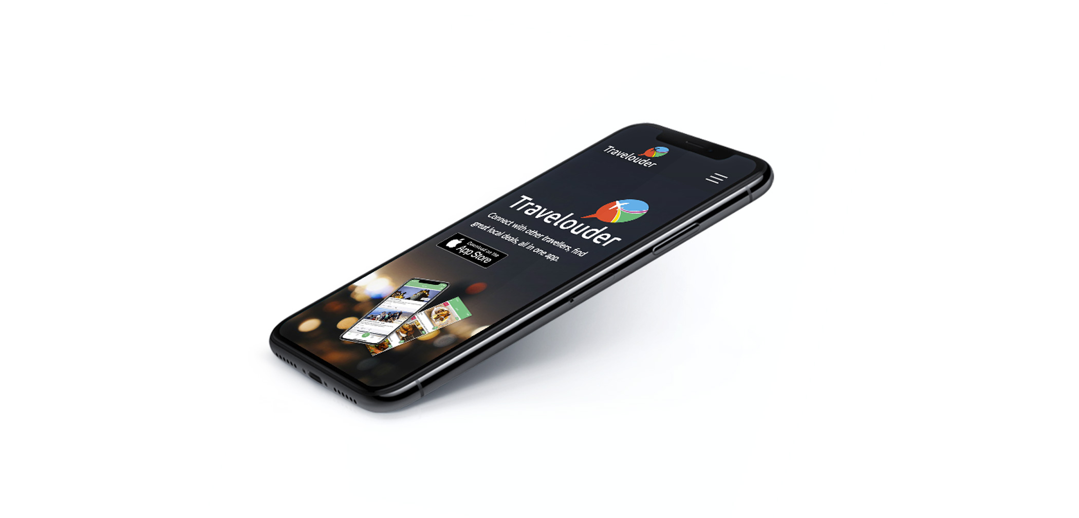
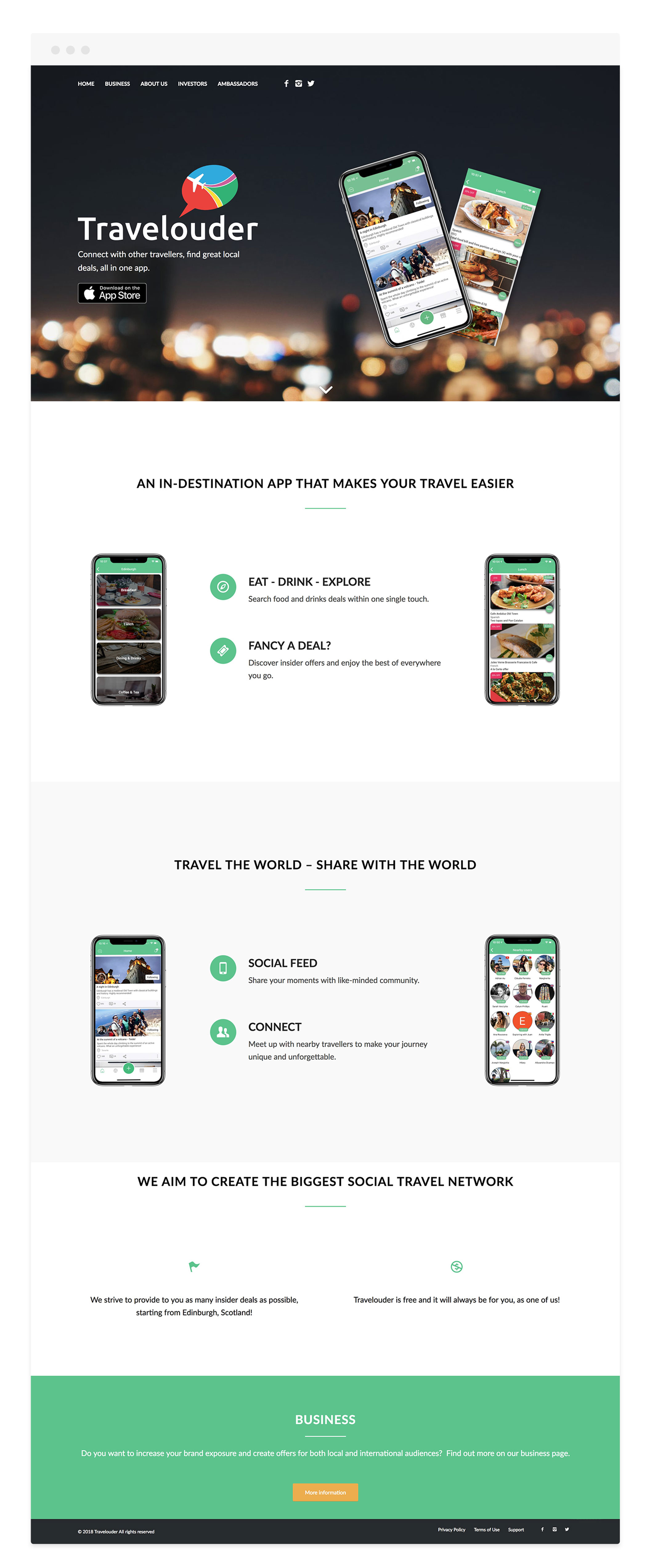
TRAVELOUDER
Web Design and Development, Information Architecture, UX-UI Design, Brand Direction.
Industry:
Travel / Travel Tech / Social network
About:
Travelouder is a social digital travel network and marketplace in one mobile application. It is a designed platform that helps people to find hidden cafés, restaurants, and other small boutiques combined with local offers and deals.
The product goal is to effectively connect tourists and tourism-related SMEs e.g. (food & drink enterprises, tourism activities, points of interest, shopping places, beauty salons and spas). Travelouder also provides a platform for businesses to present their products and promotions to the local and tourist audience. The start-up is aiming to increase the profile of local businesses by enabling them to update their products and offers, appealing to the locals and tourists of the selected destination.
Travelouder also facilitates tourists planning – in city journeys according to their personal interests combined with the discovery of surrounded points of interests. Business intentions are to cultivate a diverse travel community and support local business via Travelouder network.
Task:
To design a prototype and build a fully-responsive website using WordPress CMS – to showcase and validate the product to the investors and stakeholders. To design and create a unified visual language and translate product benefits, expectations and features on the new website.
Type of work:
Worked remotely and in-person on daily basis along with start-up founder.
Project length:
3 weeks.
Location:
Edinburgh, UK.
Commitments:
To design and build the website using prototyping and CMS (Content Management System) tools.
1
Discovery
Project definition and discovery session
The project started with a product discovery session. The start-up founder talked about the product in details. We have covered all parts of the start-up including product vision, goals and the website part in the larger picture. This meeting was important for getting familiar with the product features and the client. Also, we discussed the nature of the project in terms of budget, delivery time, limits and constraints. We also covered many technical and creative capabilities and agreed on commitments.
Some of the important questions covered:
- Who is the target audience and what are the user needs?
- What are the business goals and what is the website role in it?
- What is the connection between the brand and the website?
- What will visitors accomplish on the website?
- How will you measure the success of the website?
- What do you like and dislike about competitors websites?
- What are the style guides and existing design assets?
- Does the client need to make changes and updates on his own in the future?
Main takeaway:
The main goal of the meeting was to gather information for creating a website, and allow discussion between us. This was a great kick-off session that highlighted project size and scope in details.
Over this stage, we decided to not run an in-depth user research, but rather focus on site architecture based on our experience and assumptions of potential website users. The start-up has already carried out product research, that helped us to focus on the main goal of the website – to be a source of information and inspiration tailored tor potential investors.
Identifying the brand
I have used a brand research method called X-Factor by design studio Futur. This method helps clients see why their business is different from others. It’s also a great research method to discover the brand that will help to define the direction of the website. Using the insights from the discovery session also helps to identify content for the website that is unique and tailored for the client.
Inspiring websites
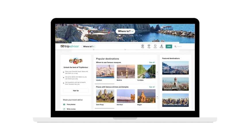
Tripadvisor
- Well organised information and easy legibility.
- Easy navigation, working well on desktop and mobile devices.
- High-quality images and consistent icon and image styling.
- Well-designed columns layout grid.
- Good use of CTA buttons.
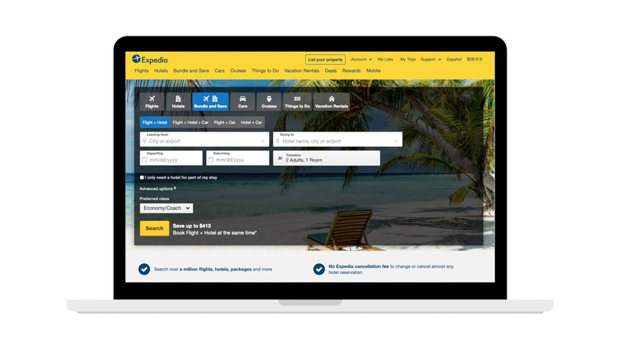
Expedia
- The home page looks too complex but well organised.
- Too many subpages and categories.
- The layout reflects well Expedia brand colours, images and icons.
- Visual hierarchy and consistency across all other pages.
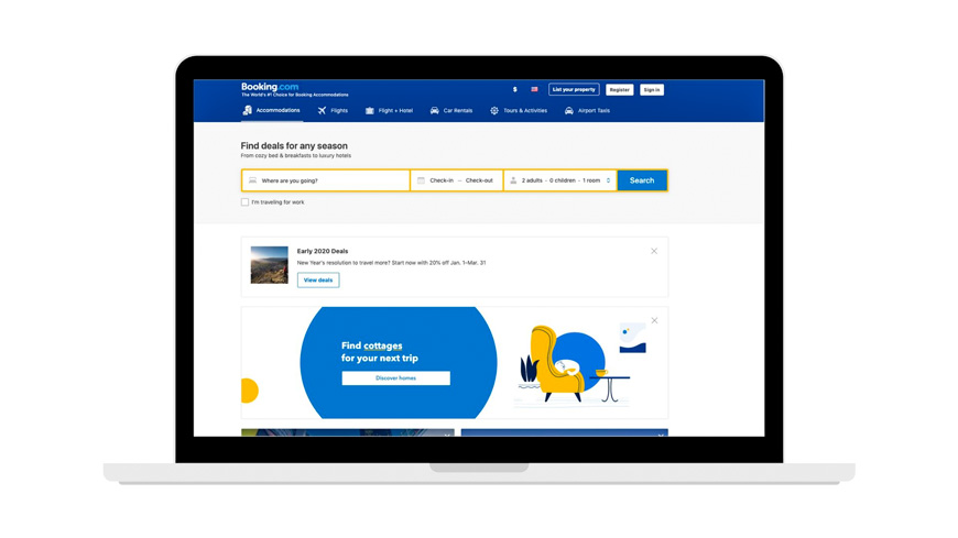
Booking.com
- Well organised complex landing page.
- Good use of typography and different font-weights.
- Visual consistency in header, body, footer elements.
- Easy and simple navigation.
- Adaptable and works well across all devices.
Takeaway:
All websites show a good visual hierarchy with easily accessible information. Good use and consistency of typography, imagery and icons. All websites adopt simple brand colours across all pages. All pages work well both on desktop and mobile devices. Good text legibility and font-sizes. The important information can be found above the page fold on each example.
2
Ideation
Defining the sitemap
To define the site-map for the start-up I had to look into the working application prototype. I had to learn and understand the key features and functions of the app in order to visualise the website and better define the site-map. Already by conducting the project discovery stage has given me a good understanding of the business strategy. By learning more about the application from the founder helped to identify the content needed to be displayed on the website. We simply sketched the site-map and listed all the information required to be displayed on each page.
3
Design
Low fidelity wireframes
After identifying brand, site map and evaluating inspiring websites I focused on sketching down low-fidelity wireframes for the website header and footer, including desktop and mobile layouts. At this stage, it was important to have an open conversation with the founder while reviewing quick wireframe ideas. The purpose of this session was to focus on information architecture and it’s placement across pages. Having information organised helped us easily convey information to the users. By sharing ideas and sketches we managed to review and improve website content in the early phase.
Basic header design to see how it’s going to look and work on mobile and desktop devices.
This is how the footer would look on mobile and desktop devices.
We wanted to create a simple and informative homepage, highlighting product benefits with a simple call to action at the end of the page. To support the information we had to create mock-ups for the key feature of the application. I also envisioned source images, fonts and icons for this page. I worked closely with the founder on all information going on this page.
The layout style stayed similar to the homepage, but we wanted this page to be more informative and show more information about the application features and benefits.
Logo, icons and colour elements
It was important to define the colour pallet and icon style for the website. By looking at the already designed Travelouder brand logo and the application I was able to pick the main content colours. These colours will be used as primary and secondary for background, typography and icons.
Typography
We have considered several fonts for this page, but I wanted it to be on-brand with the applications, therefore we used the same font-family. Also, we considered font-sizes for navigation, body and extra website elements. We wanted to have a good legible text size combined with good colour contrast for increased readability.
Delivering high-fidelity wireframes
After review of basic wireframes, information architecture, writing a copy, defining website elements, I moved on to designing high-fidelity (realistic mockups) with Adobe XD prototyping software.
4
Development
Building the website
After several reviews, I have moved on to building a website with WordPress CMS. Creating websites using WP content management system and web development tools was already familiar to me. Having built websites in the past helped me to visualise the web development process. Some of the work included setting-up the domain, WP and theme installation on an existing server.
I have started building the website and I have moved designs assets and other important site elements on to the pages. Having website wireframes done earlier – helped the development process to go smoothly. Adrian also helped and exchanged working data information while setting everything up.
Conclusion
As work moved closer to the end, there was hardly any revisions required, no changes in copywriting or neither changes in information architecture. Adrian has worked closely with me on this project, facilitating and giving honest feedback on web design and development stages when needed.
In the web development process, some WordPress technical details were challenging, some concepts were way more complex to implement both in terms of design and development. But in the end, we successfully managed to launch a website with small changes.
We have created a website to showcase the mobile application with inspiring and informative design. It was a pleasure to work with the founder and I have learned a lot about the digital product and working environment of the fast passed start-up.
If I had to work again on a similar project – I would follow a very similar design process. I would keep close contact with all project stakeholders.
“Tadas has helped us to design and develop our website while we were only at the idea stage. He was very skilful, enthusiastic and it was a pleasure to work with him.”
